Take home cards for conventions


In one week I'll be having a small display at a local indie game dev convention (TTRPGs at Port Melbourne) and I'm both terrified and excited.
It's my first time making a game, let alone having something like a table at a con to showcase anything I've made but I've been thinking about all the things I could do to try and make it eye-catching and interactive but short and sweet since I shouldn't expect people to stick around for super long as they move about.
Aside from obvious things like signage that calls out to the types of players who would be interested in this game ("Do you love making endless amounts of characters? Do you world building?") as well as having prototype cards for people to play with, I decided it would be a lot of fun to make something a bit more interactive that would result in a cute keepsake for them to take home and remind them of my game.
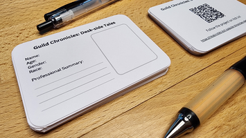
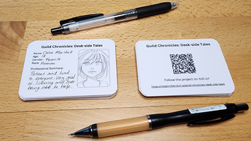
I've made these simple "Staff ID Cards" that have some basic character creation details on the front, space for an ID photo and then the back is where the link to this itch.io page is available via QR Code and the link itself. I'm hoping people will find it fun to make a quick character on the spot using just one of the character creation features of the game, being the professional summary section. The fact they can take it home will hopefully help keep the game in their minds as well as give them something to show their friends to help generate more interest.
That's the big hope and I hope something like this is really good for getting people engaged with the game while it's still in early development.
Tech details on making the cards:
The card layout and QR code were made in Canva and then I just printed them back and front with my home printer on some thicker 250gsm paper. Using Adobe Acrobat's multiple pages to a sheet feature, I was able to fit 8 cards per A4 sheet. Then it was just a matter of cutting them out and using a craft cutter to add the rounded edges to give them a bit of a nicer finish. Alignment front and back isn't perfect but given the simplistic look of the cards, it's not obvious but if you do something with borders you might need to tweak settings somehow.
Guild Chronicles: Desk-side Tales
Running the front desk of the Guild, slowly build the world based on the people you meet and the stories they share.
| Status | In development |
| Category | Physical game |
| Author | HitokiriChibi |
| Genre | Card Game |
| Tags | Cozy, Creative, Fantasy, First-Person, journaling, Narrative, Relaxing, Singleplayer, Tabletop role-playing game |
More posts
- Future development based on PAX feedbackOct 15, 2024
- PAX Melbourne 2024!Oct 10, 2024
- Cover ArtOct 03, 2024
- Quick-start Guide Comic WIPJul 12, 2024
Leave a comment
Log in with itch.io to leave a comment.